Project Snapshot
Client: Madok Developments Ltd
Industry: Custom home development and construction, high-end residential
Location: Kamloops and the BC Interior, with projects in Tobiano and the Shuswap
Services provided: Brand development, website design, social media setup
Project type: Full brand development, built from the ground up
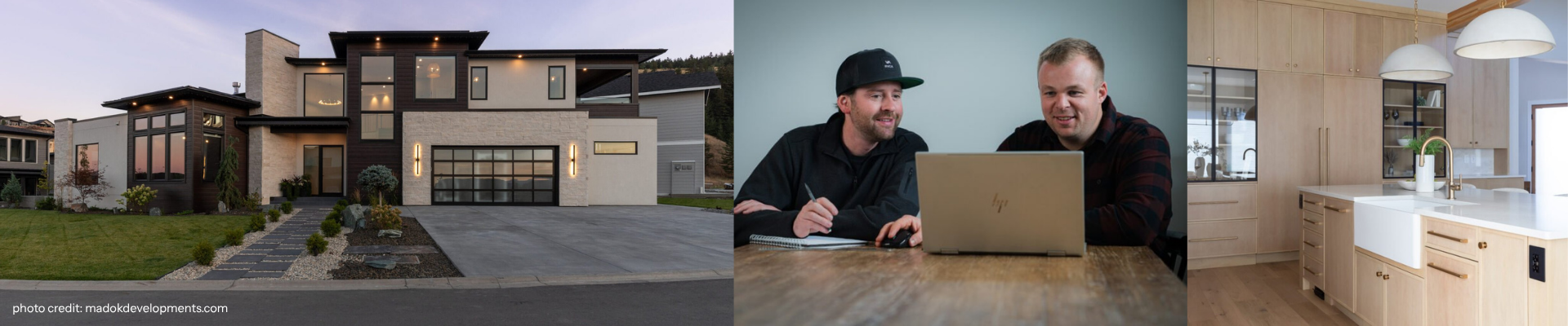
Madok Developments takes on high-end custom home projects, from design through to build. They are not a spec-home builder. Every project is bespoke, which means their brand needed to be too.
The Challenge
Madok was a brand new business, launching from scratch in a market where established builders already had years of reputation behind them. There was no visual identity, no website, and no social presence to introduce the business or explain what set it apart.
For a builder targeting a premium, niche clientele, that gap matters. Clients considering a significant investment want to feel confident before they ever consider picking up the phone, and reputation alone can only carry a business so far. Madok needed a brand that reflected the calibre of the homes it was building, so the impression mirrored reality the moment someone found them online.
The goal was to keep taking on a number of exceptional, architecturally interesting projects and to have a brand that made that intention obvious at first glance.

The Process
Research
Before any design work began, Pepper looked closely at the type of client Madok wanted to attract and the wider custom home market they were entering. That work surfaced a clear opportunity: a gap for a brand that felt minimal, elevated, and quietly confident, rather than rustic or corporate.
Creative Direction
The mood board leaned into what the team described as “gentleman’s club” energy: dark, warm neutrals, clean lines, and understated confidence.
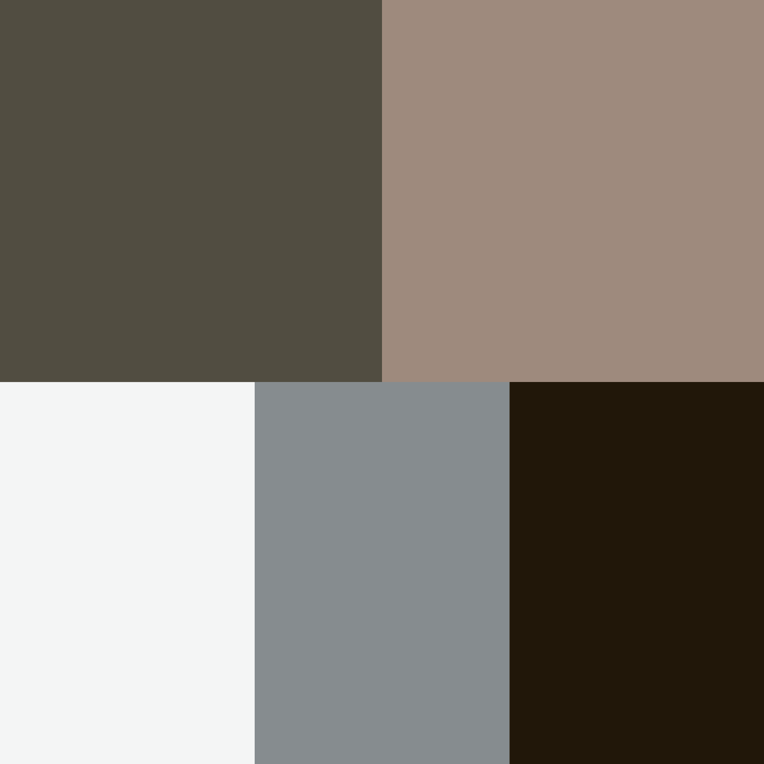
The palette moved deliberately away from anything trend-driven or vibrant. No orange, no red, nothing that would date quickly or compete with the architecture itself. A near-black, a warm taupe, and a muted olive-grey gave the brand its “classic sophistication” feel while remaining modern enough to sit alongside sharp, contemporary home photography.
Typography followed the same logic. Chivo Light for headings brings elegance, Space Grotesk adds a slightly technical, architectural edge for subheadings, and Roboto Condensed keeps body copy clean and easy to read. Together, they read as considered rather than decorative, which fits a brand built around custom design rather than off-the-shelf solutions.
Design Development
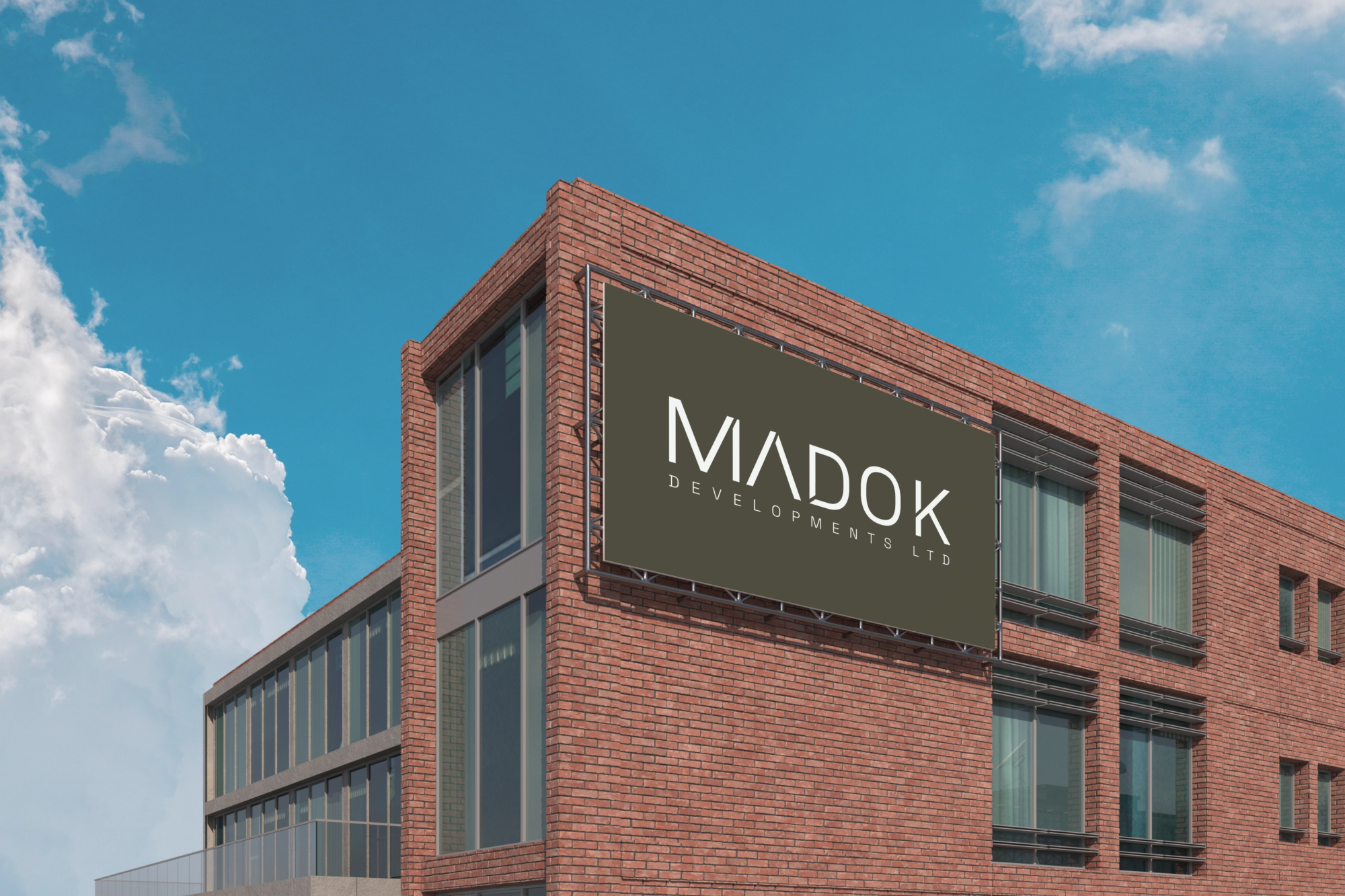
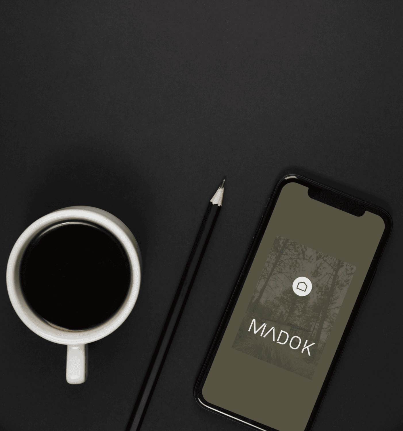
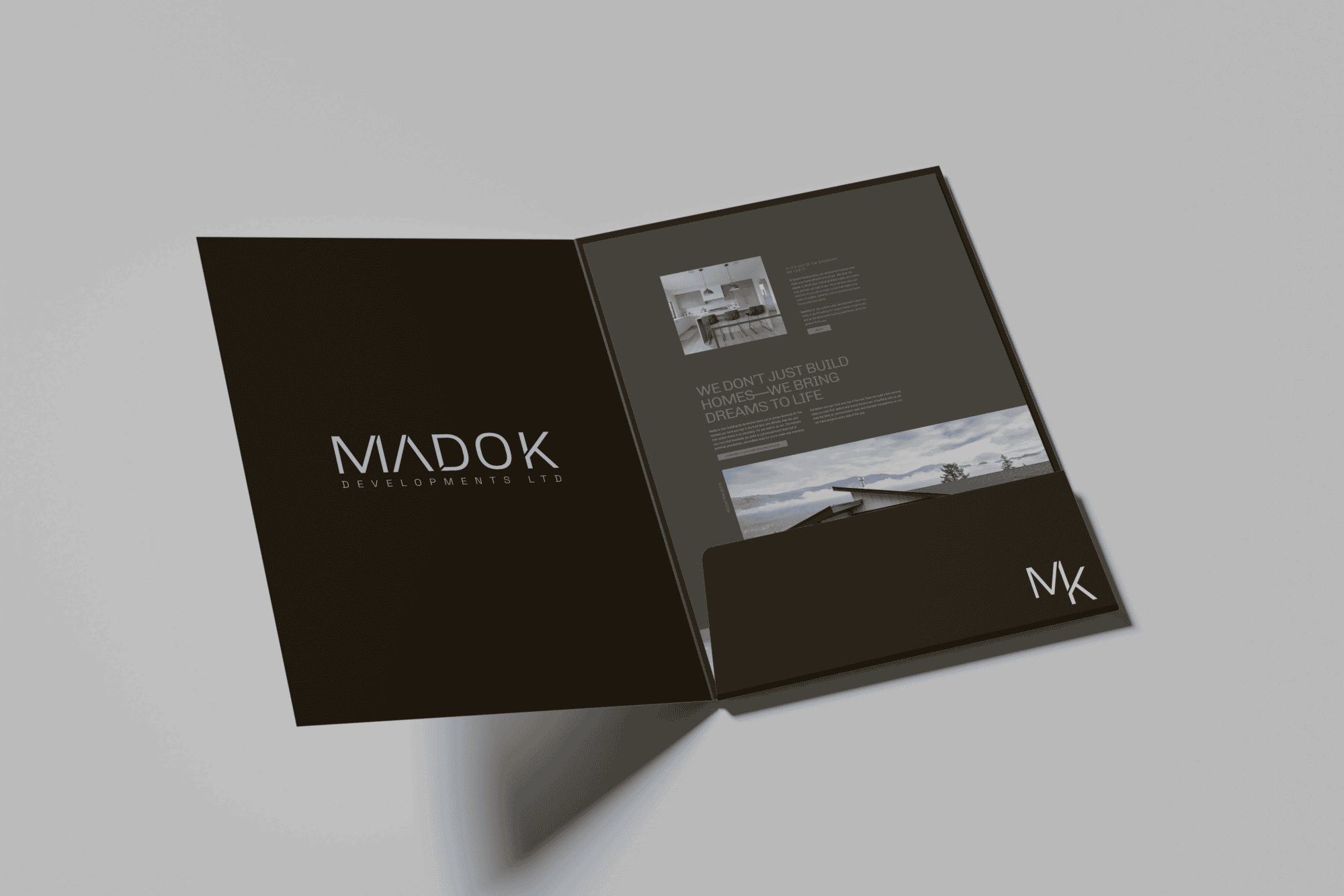
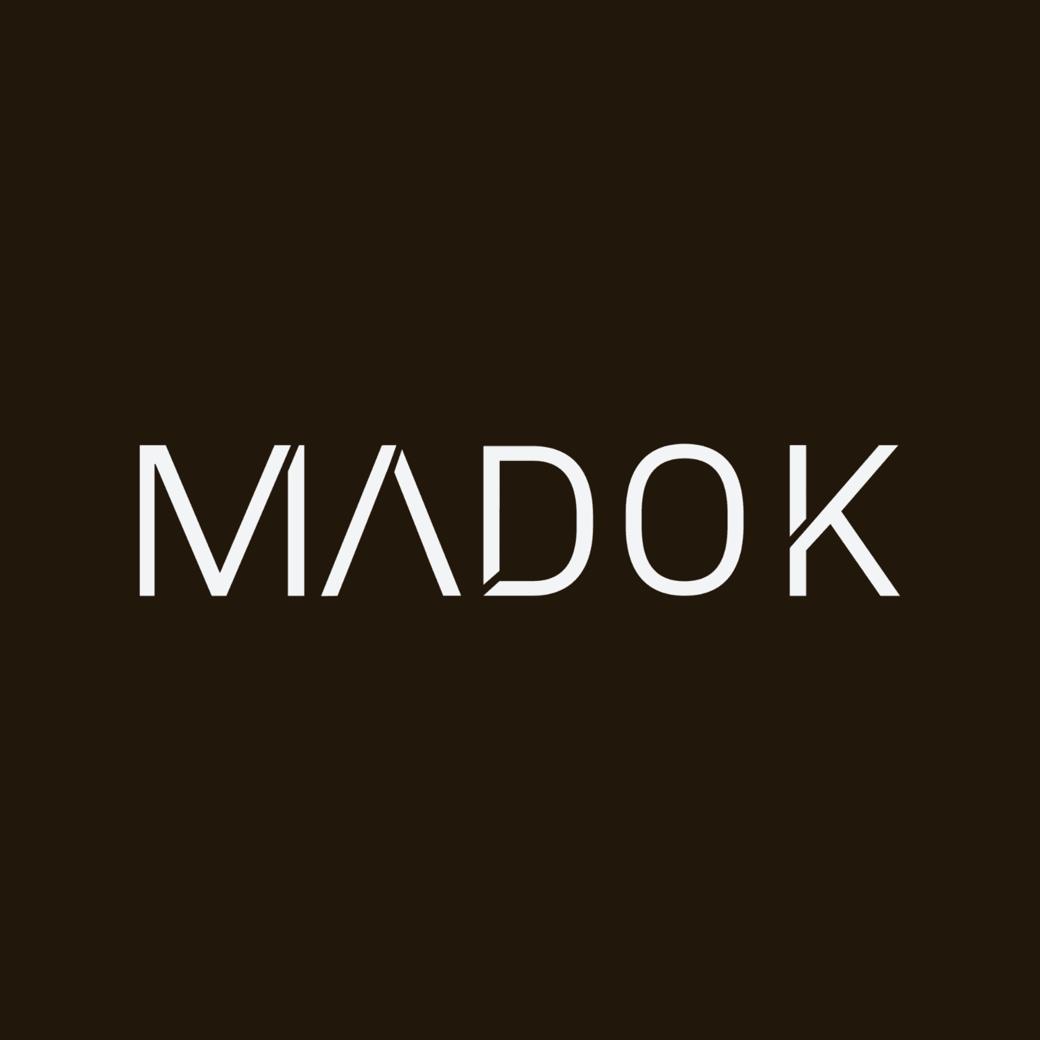
The core idea behind the logo was simple: make the brand as considered as the homes it represents. The wordmark uses sharp, angular letterforms with a distinctive negative-space cut through the A, giving it a quiet architectural detail without turning the logo into a house icon.
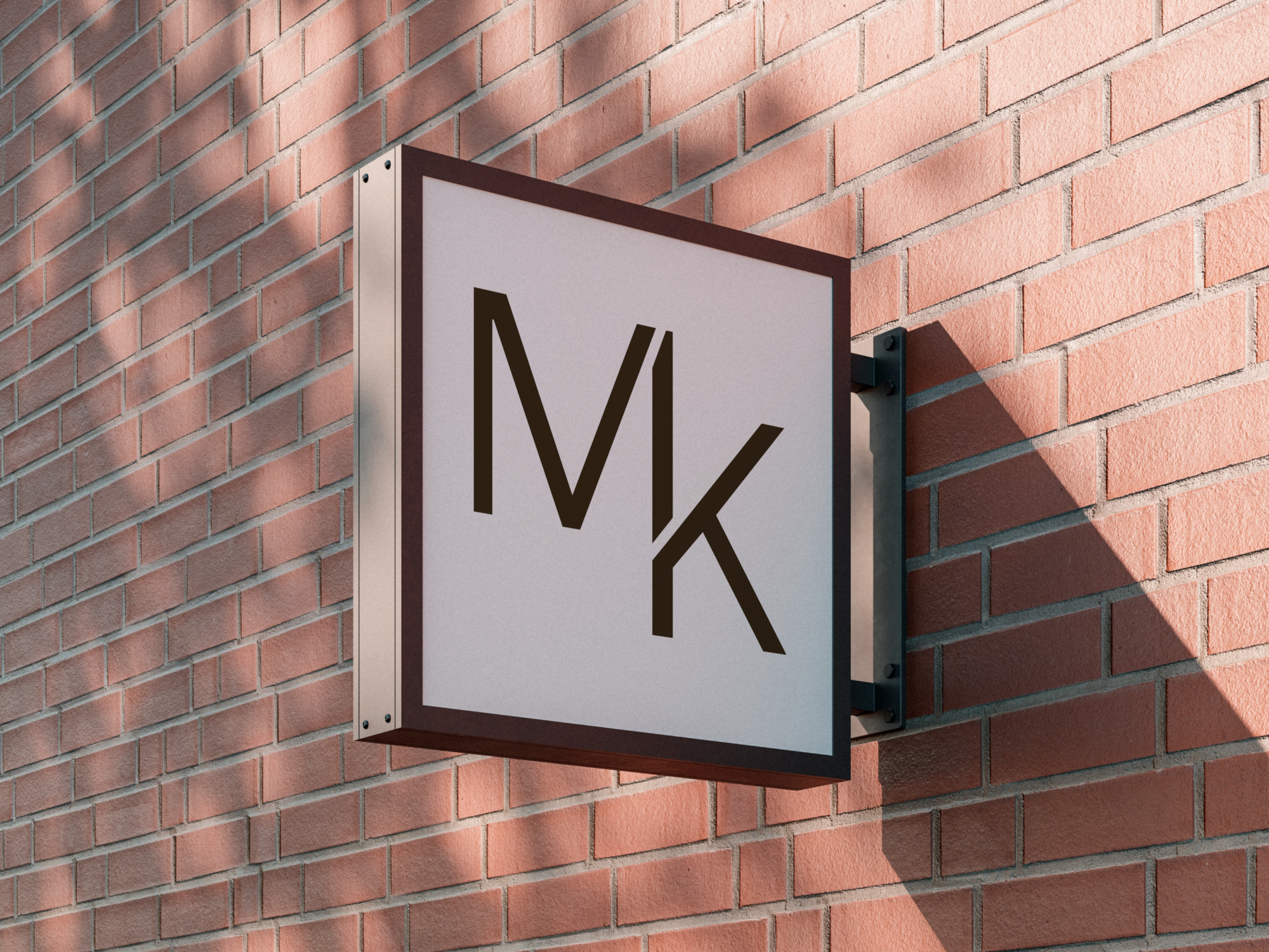
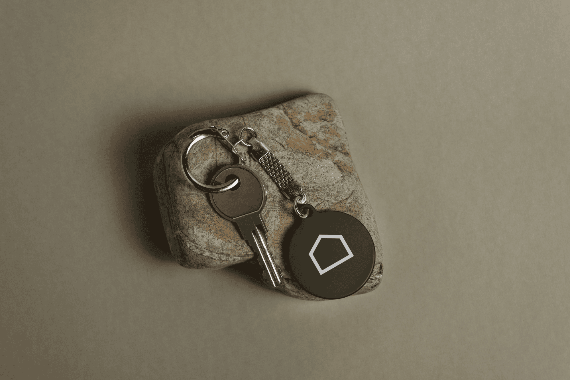
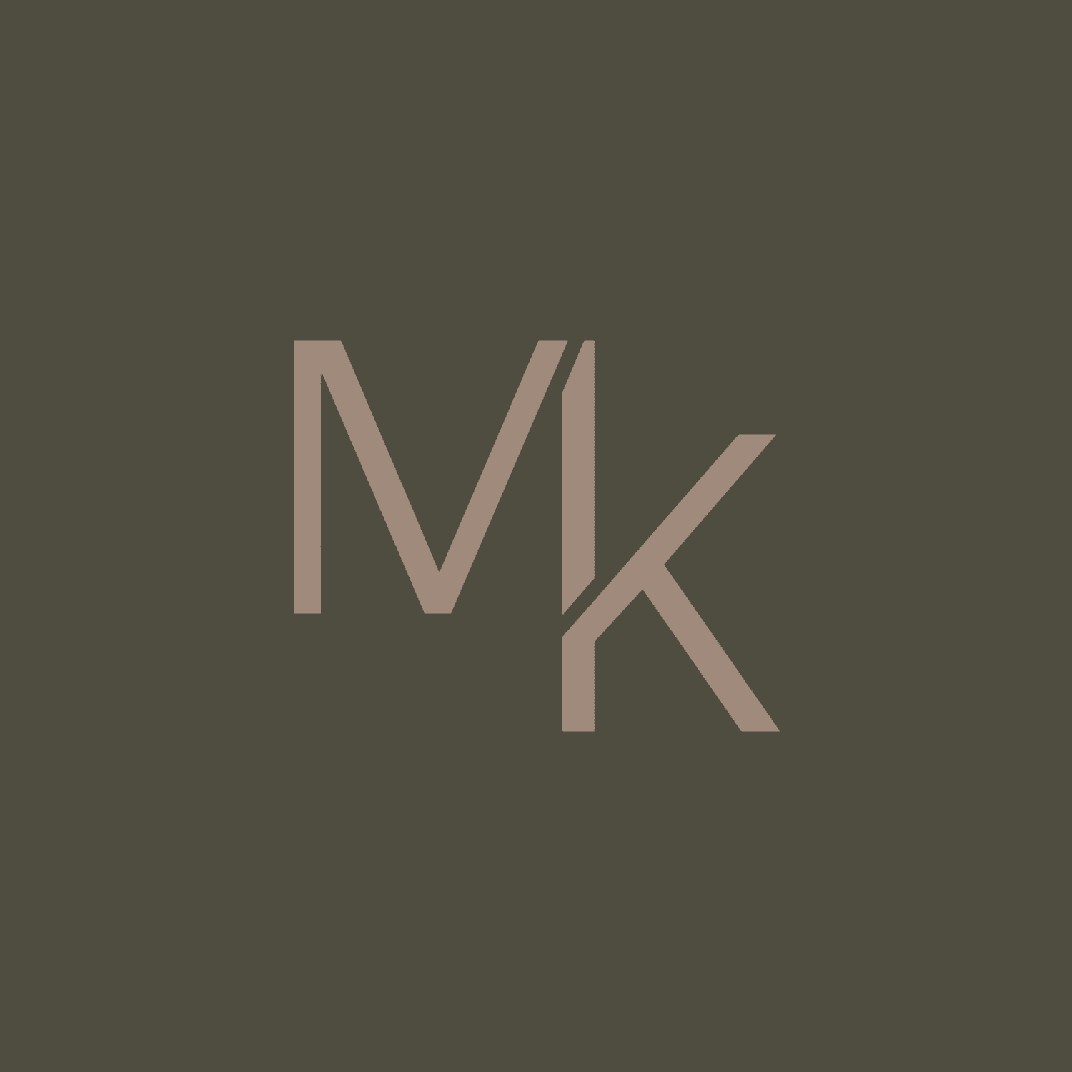
That restraint carried through into a secondary monogram, an “MK” mark built from the same letterforms, designed for smaller applications where the full wordmark would be too much. A softer supporting element, a simple house-shaped stamp, gives the system a bit of flexibility for social and web use without undercutting the primary mark’s minimalism.
The main challenge was balancing “edgy” against “timeless” for a business that needs its brand to still look right in ten years. The angular wordmark solved that: distinctive enough to be recognizable, simple enough to age well.
The Results
The Outcome
Madok Developments launched with a brand that looks like the homes it builds: considered, distinctive, and built to last. Instead of stepping into the market with no identity, the business had a wordmark, website, and social presence that all say the same thing from day one.
For a new business entering a market of established builders, that head start matters. Madok didn’t need years to build a visual reputation to match its ambitions. It launched with one already in place, ready to support the ambitious, custom projects the business set out to build in the first place.