Project Snapshot
Client: Smart Options
Industry: Supported employment agency, connecting job seekers with diverse abilities to inclusive Kamloops employers
Location: Kamloops, BC
Services provided: Brand Refresh (Discovery Session, Brand Audit, refreshed logo suite, updated colour palette and typography, visual style direction, brand guide, custom brand assets)
Project type: Brand Refresh — a returning client. Pepper built Smart Options’ original brand identity four years earlier. This project modernized that identity to match where the business is now.
The Challenge
Smart Options has spent over 25 years connecting Kamloops employers with talented, capable job seekers who happen to have disabilities. The team behind it is warm, energetic, and deeply community-minded, and that comes through in everything from their event presence to their social media.
The brand just hadn’t caught up to what the business had evolved to!
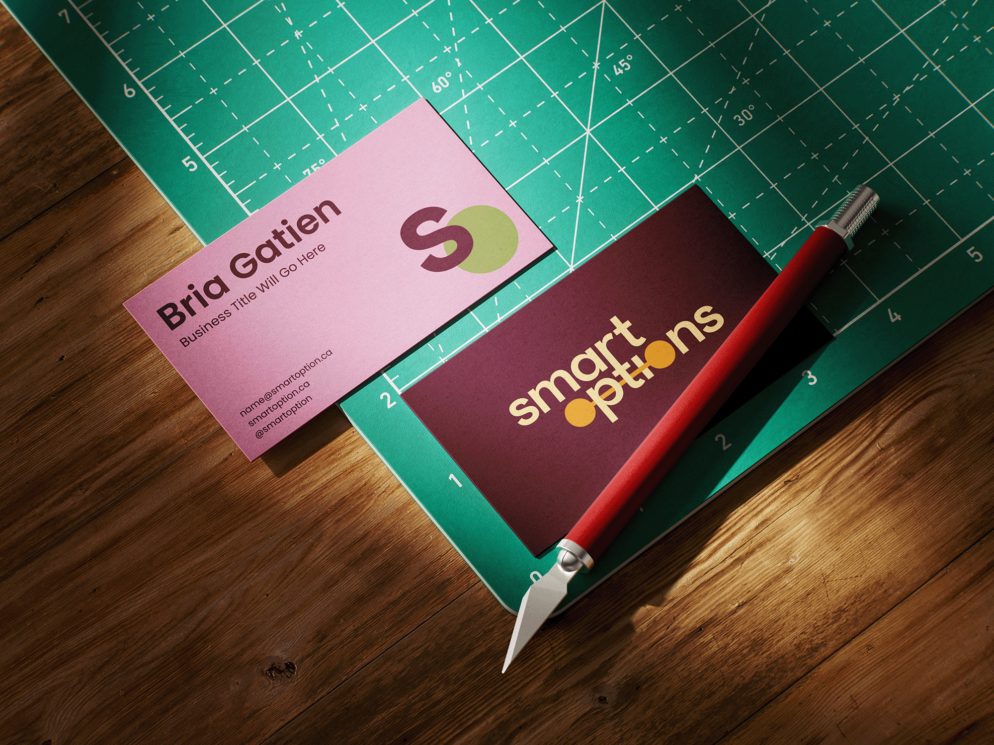
The existing logo, colours, and typography felt muted next to the personality Smart Options brings to every interaction. Some materials, including business cards, were hard to read due to low contrast, and the overall look leaned more toward the generic, forgettable identity people expect from a government-funded agency than toward the vibrant, professional organization Smart Options actually is.
That mismatch mattered. Employers often meet Smart Options before they understand what the agency fully does, so the brand needed to do some of that convincing on its own. It needed to look as credible, current, and full of personality as the team standing behind it.
The Process
Research
Pepper started with a Brand Discovery Session and a full brand questionnaire, covering everything from Smart Options’ origin story and core values to its target audience, competitors, and the specific colours and styles they were drawn to.
The clearest finding shaping the project was that the brand’s official materials had fallen behind the business’s own content. Smart Options’ social presence had already drifted toward brighter, more energetic colours: pink, red, yellow, green, while the formal brand kit stayed muted. The refresh brought the official brand in line with a direction the business had already proven successful.
Creative Direction
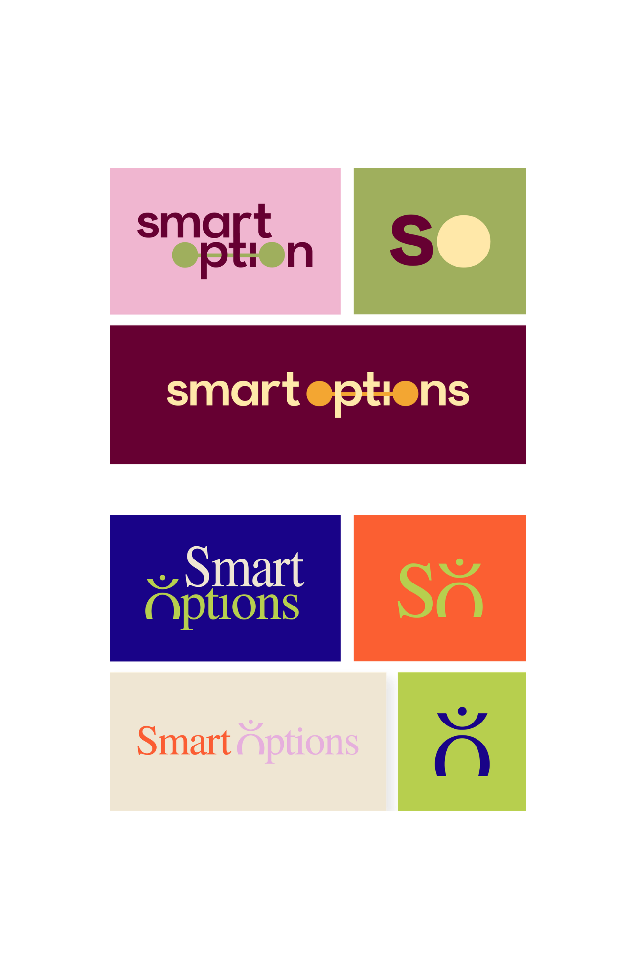
The creative direction leaned into a richer, more grounded palette that still reads as warm and energetic without tipping into the bright primary tones typical of generic non-profit branding. It’s a palette that feels considered rather than default.
Typography moved toward a pairing that directly solved the accessibility problem: a clean, highly legible sans serif for everyday use, paired with a softer serif for moments that call for warmth. This combination lets Smart Options convey competence and approachability simultaneously.
Design Development
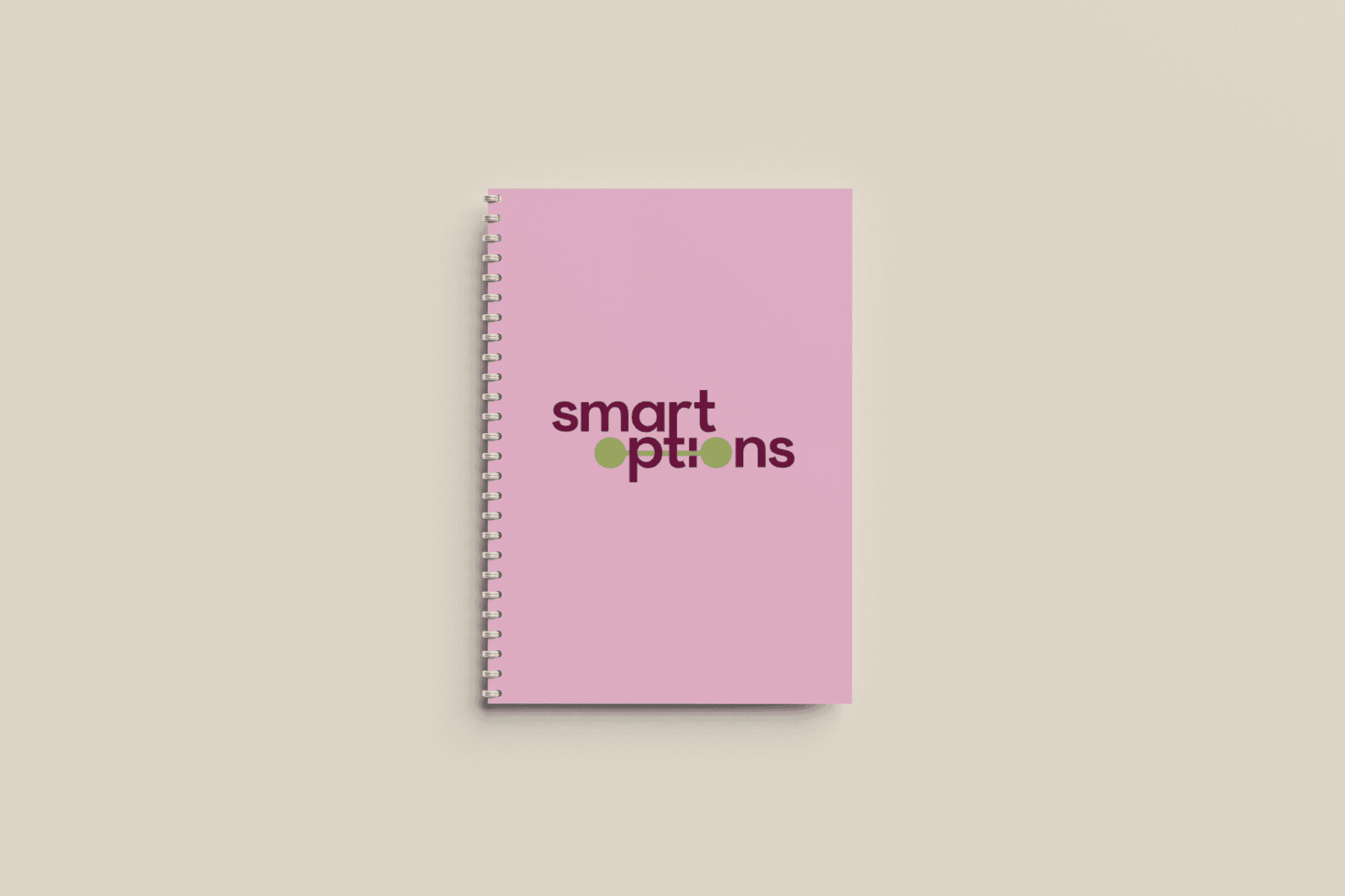
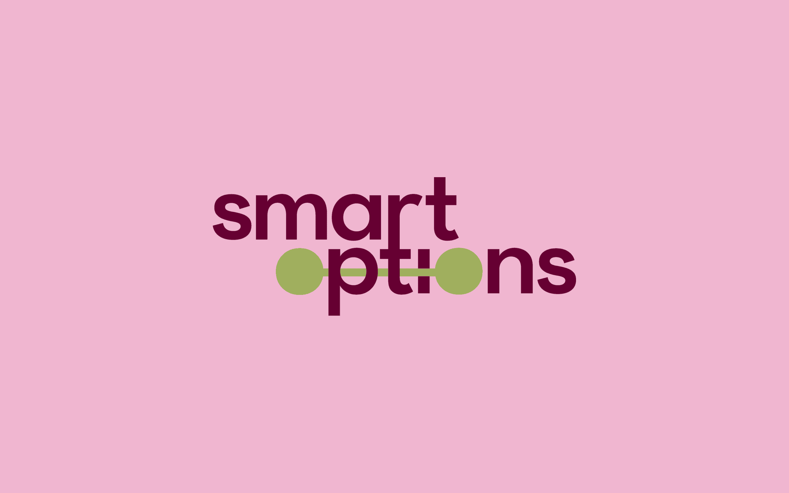
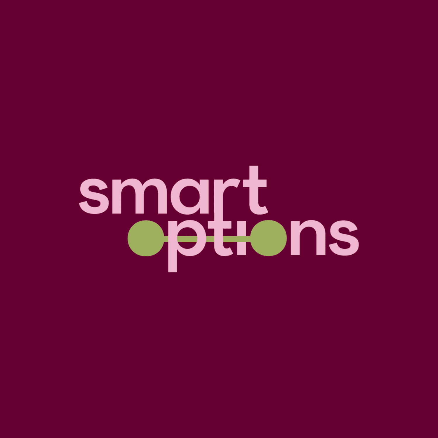
The core idea behind the logo work was intentional preservation. The refinement focused on strengthening how the existing name showed up: sharper typography, a refreshed submark for smaller applications, and colour and contrast choices that work across everything from a job fair banner to a business card. To represent the way Smart Options connect employers and employees, two connecting dots were incorporated into the logo
The main challenge was balancing two things that often pull in different directions: making the brand feel more established and credible to employers, while keeping (and amplifying) the personality that made Smart Options’ social presence work so well in the first place. The solution was to let the colour and photography convey warmth, while the logo and typography conveyed credibility.
The Results
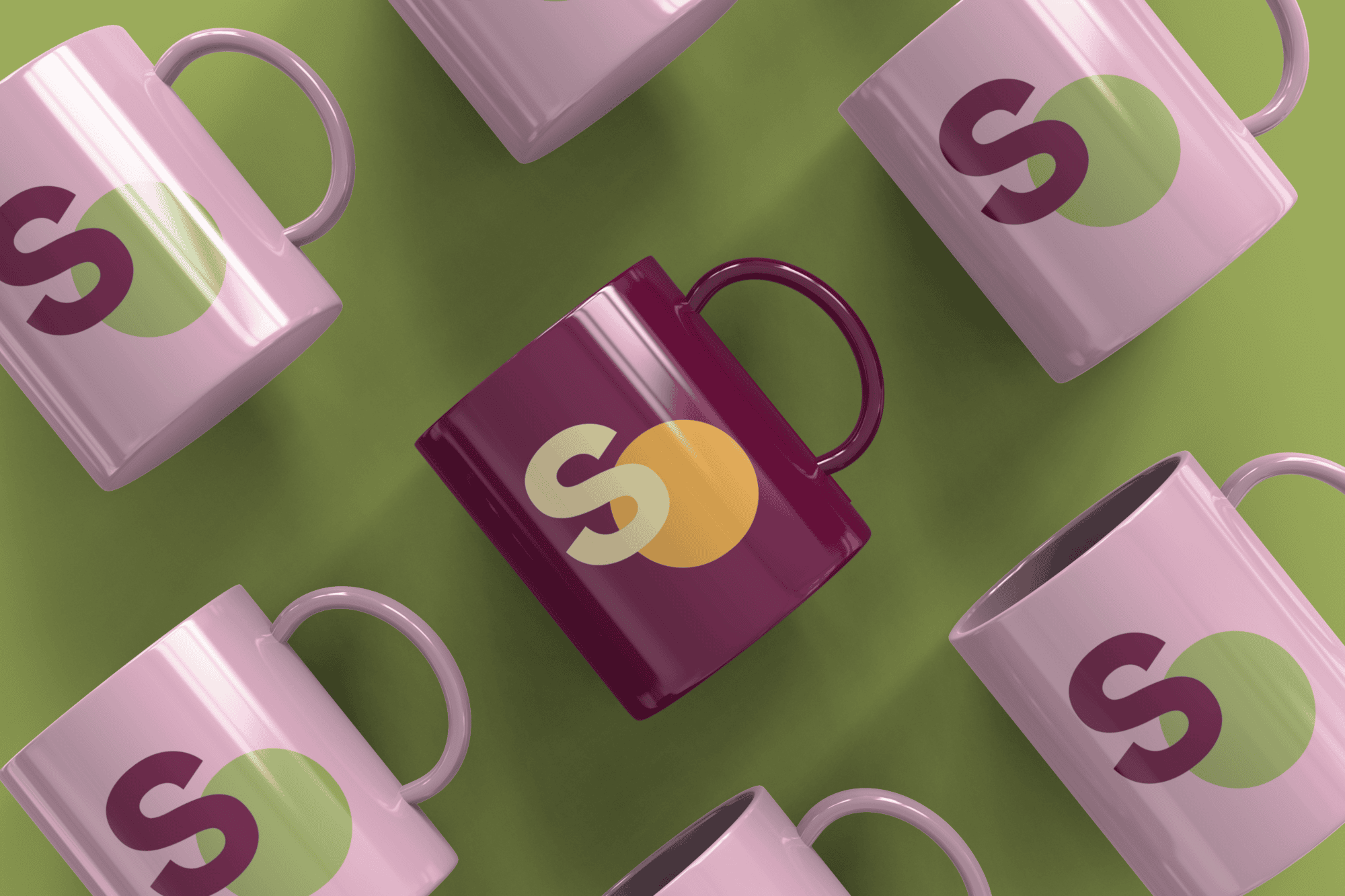
The refresh delivered a strengthened primary logo and a coordinating secondary mark for smaller applications, both designed to hold up everywhere from a website header to event signage.
The colour palette shifted from muted and easy to overlook to rich and energetic, anchored by warm, grounded tones that still feel professional. Typography was rebuilt from the ground up with legibility as the priority, replacing a font that was genuinely difficult to read with a clean, accessible pairing that keeps things warm rather than corporate.
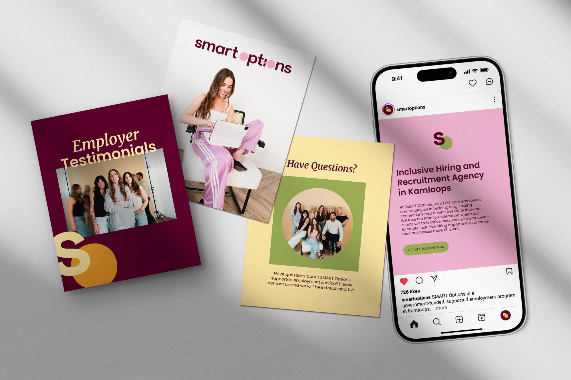
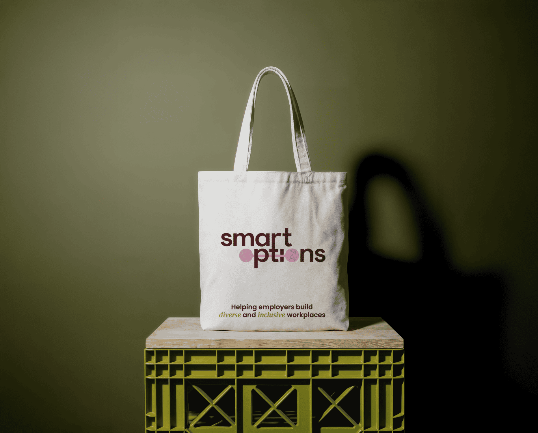
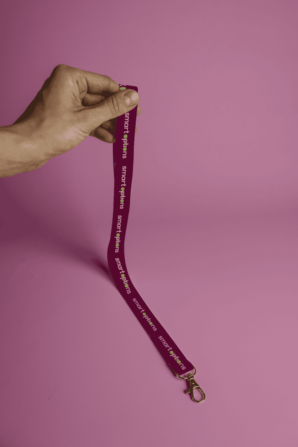
Alongside the logo and brand guide, the project included a set of custom brand assets designed to put the new identity to work right away, everything from business cards and event materials to social and web applications, all built to look and feel consistent wherever Smart Options shows up.



The Outcome
The response said it all. Partway through the project, before the work was even finished, she texted: “I’m absolutely obsessed with the rebranding. It is SO fun and welcoming. I love love love the colours.”
Once everything was delivered, she followed up: “I’m really happy with how everything turned out, it feels so ‘us,’ and the team is loving it… the final brand update is honestly even better than I hoped for!”
Smart Options has since rolled the new brand out across merchandise, social content, and community materials, sharing it with genuine pride rather than just using it because it’s official. That’s the real marker of success for a refresh: not just sign-off, but a business that actually wants to show up in its own brand. Twenty-five years into serving the Kamloops community, Smart Options finally has a visual identity that matches the impact it’s making.