Project Snapshot
Client: The Therapy Room
Industry: Counselling and mental health, private practice
Location: Kamloops, BC
Services provided: Visual Identity (logo suite, colour palette, typography system, brand guide)
Project type: Visual Identity, built for a new business launch
The Therapy Room is the private counselling practice of Kaci-Ann Phillips, a Canadian Certified Counsellor with a Master of Arts in Counselling Psychology. When she set out to launch her own practice, she came to Pepper for a visual identity that could carry the whole business from day one.
The Challenge
Launching a new practice meant starting with a blank page. There was no old logo to move on from and no dated colours to update, just a clear idea of the kind of space Kaci-Ann wanted to create and no visual identity yet to show for it.
Kaci-Ann knew that the typical clinical branding for therapy wasn’t for her. Her whole approach to counselling is warm and human, built on making people feel comfortable enough to be honest. The visual identity needed to say that before a client ever booked a session, so the first impression matched the experience waiting on the other side.
The Process
Creative Direction
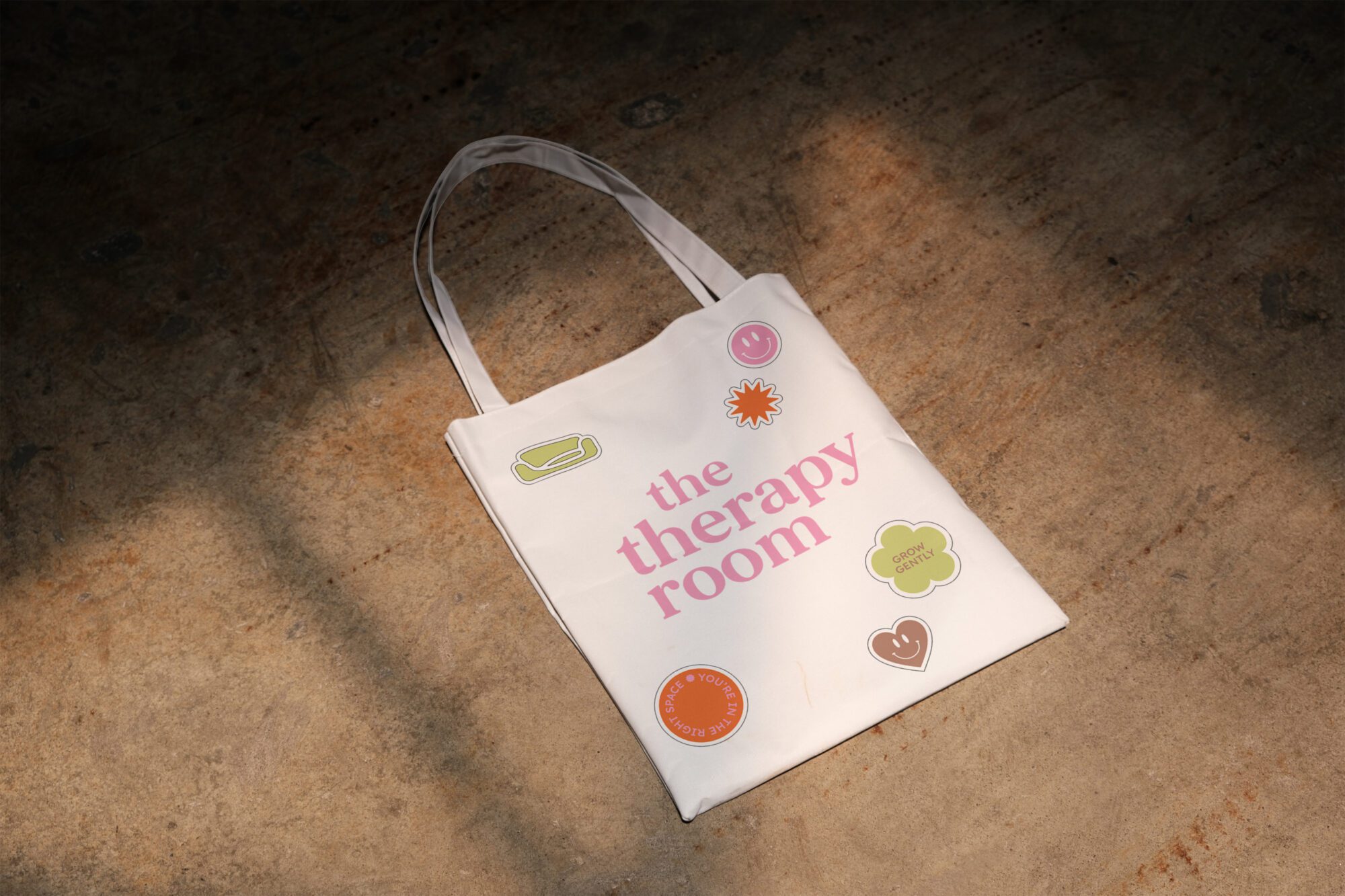
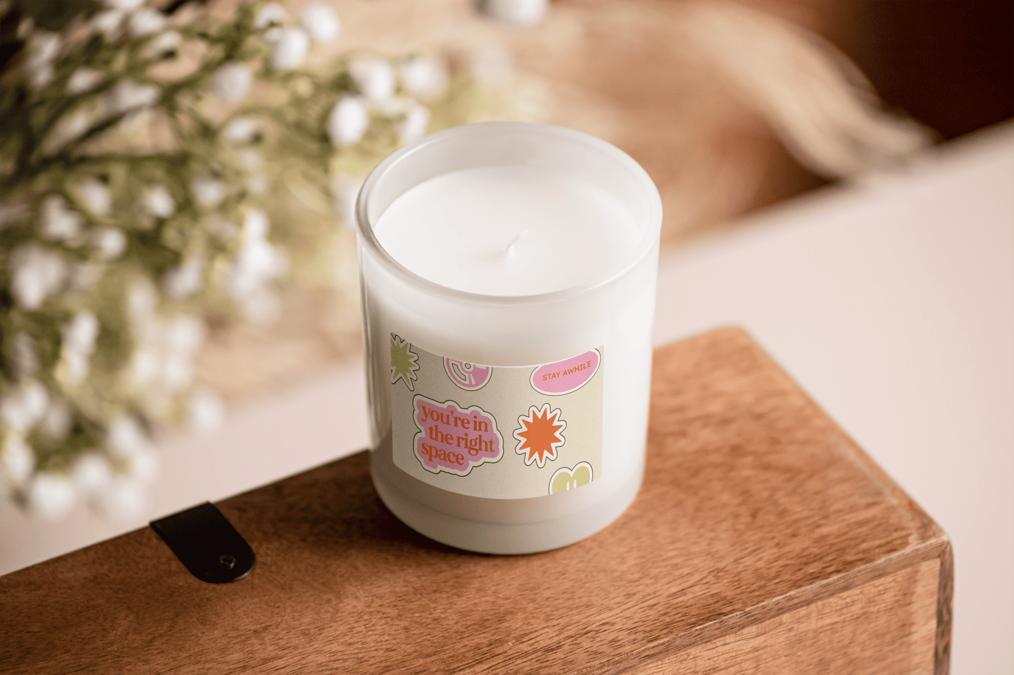
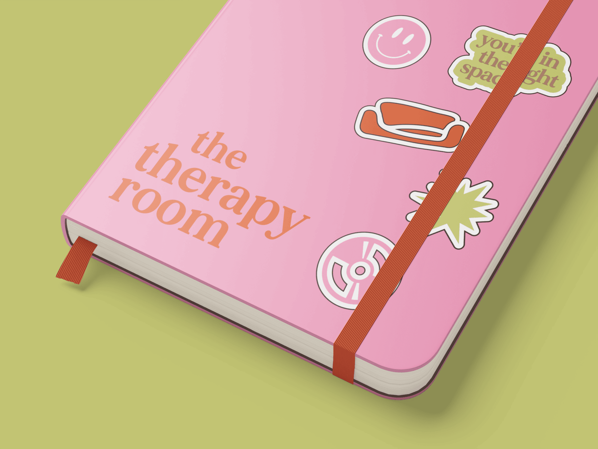
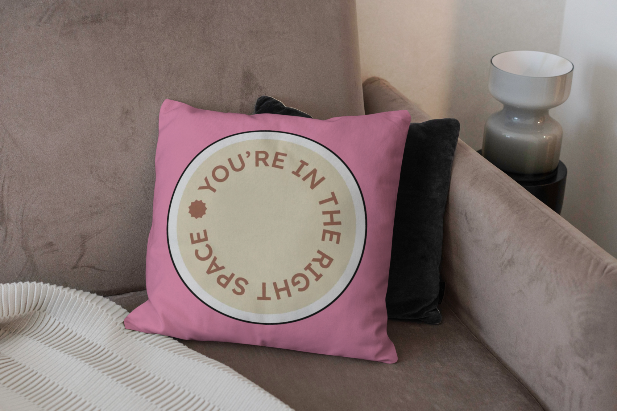
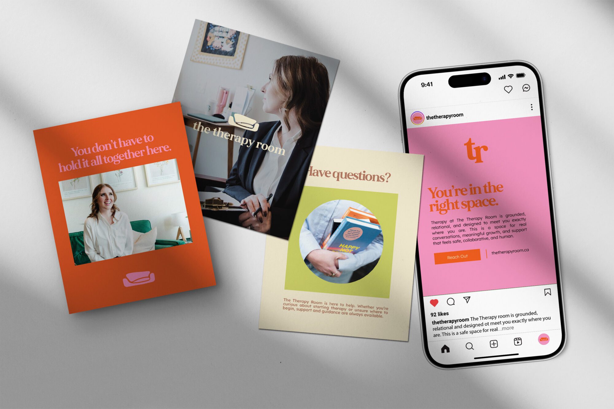
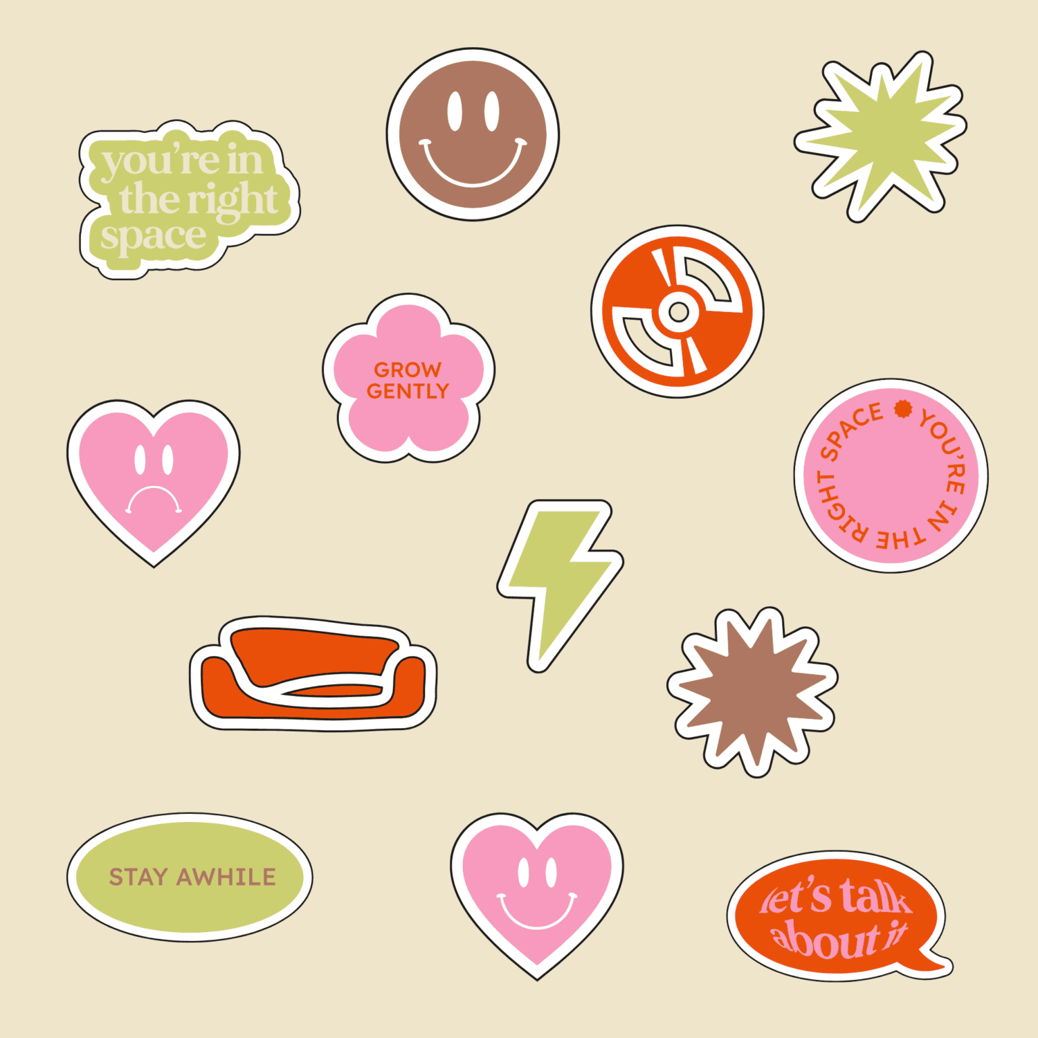
The mood the team worked toward was warm and retro-inspired, which was the direction Kaci-Ann wanted to go. Instead of the blues and greens that read as “medical,” the palette leans into pink, orange, green, brown, and beige, tones that feel human first and healthcare-adjacent second.
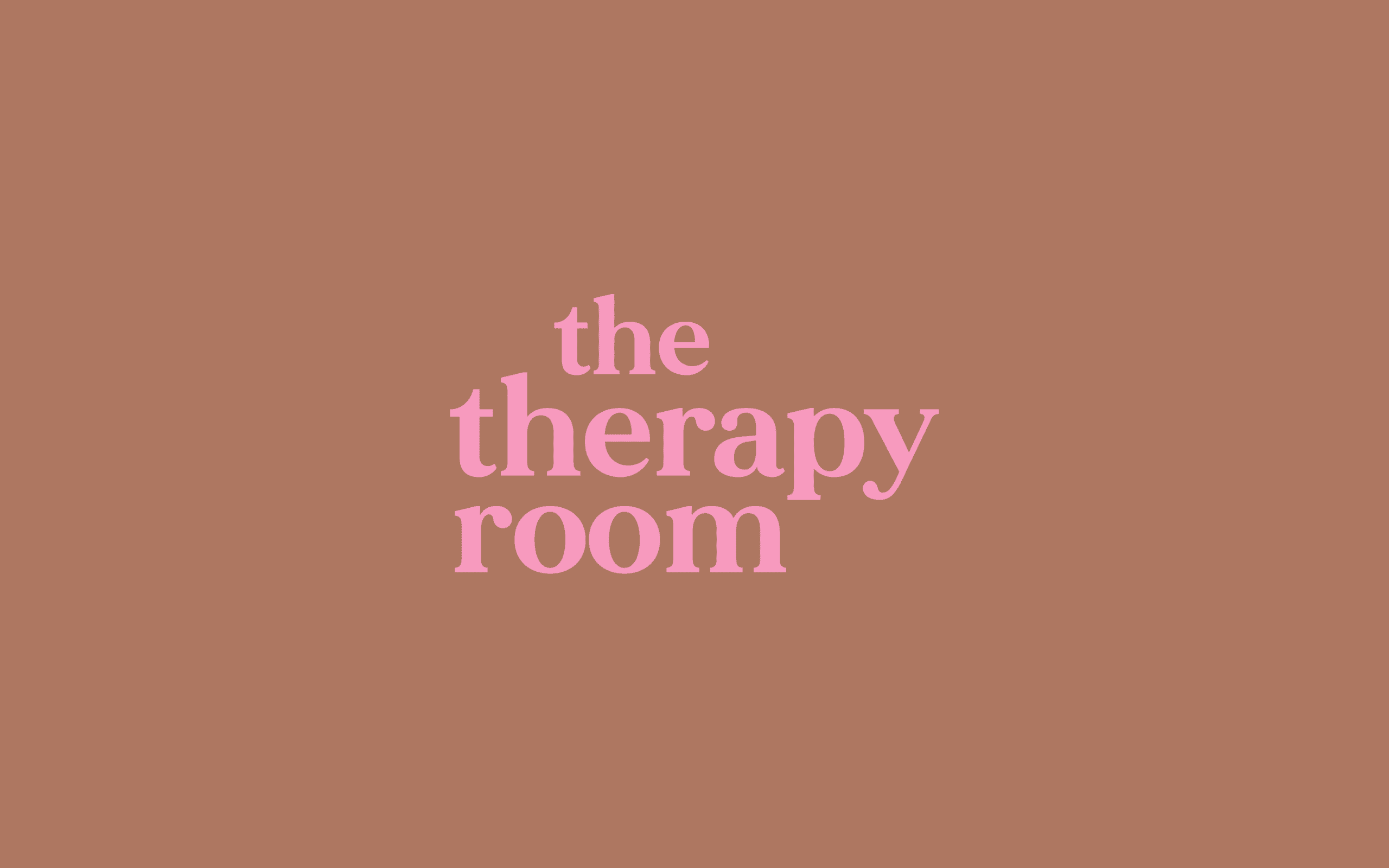
Typography followed the same logic. A soft, bold serif for headers brings warmth and a boutique feel, while a clean, modern sans serif for body copy keeps everything easy to read. The pairing lets the brand feel elevated without feeling distant.
Following Pepper’s usual visual identity process, Kaci-Ann reviewed a moodboard of colour and typography directions before the team narrowed in on the palette and type pairing that made it into the final guidelines. Each choice was tested against the same question: Does this feel like a space where someone would want to slow down and be honest?
Design Development
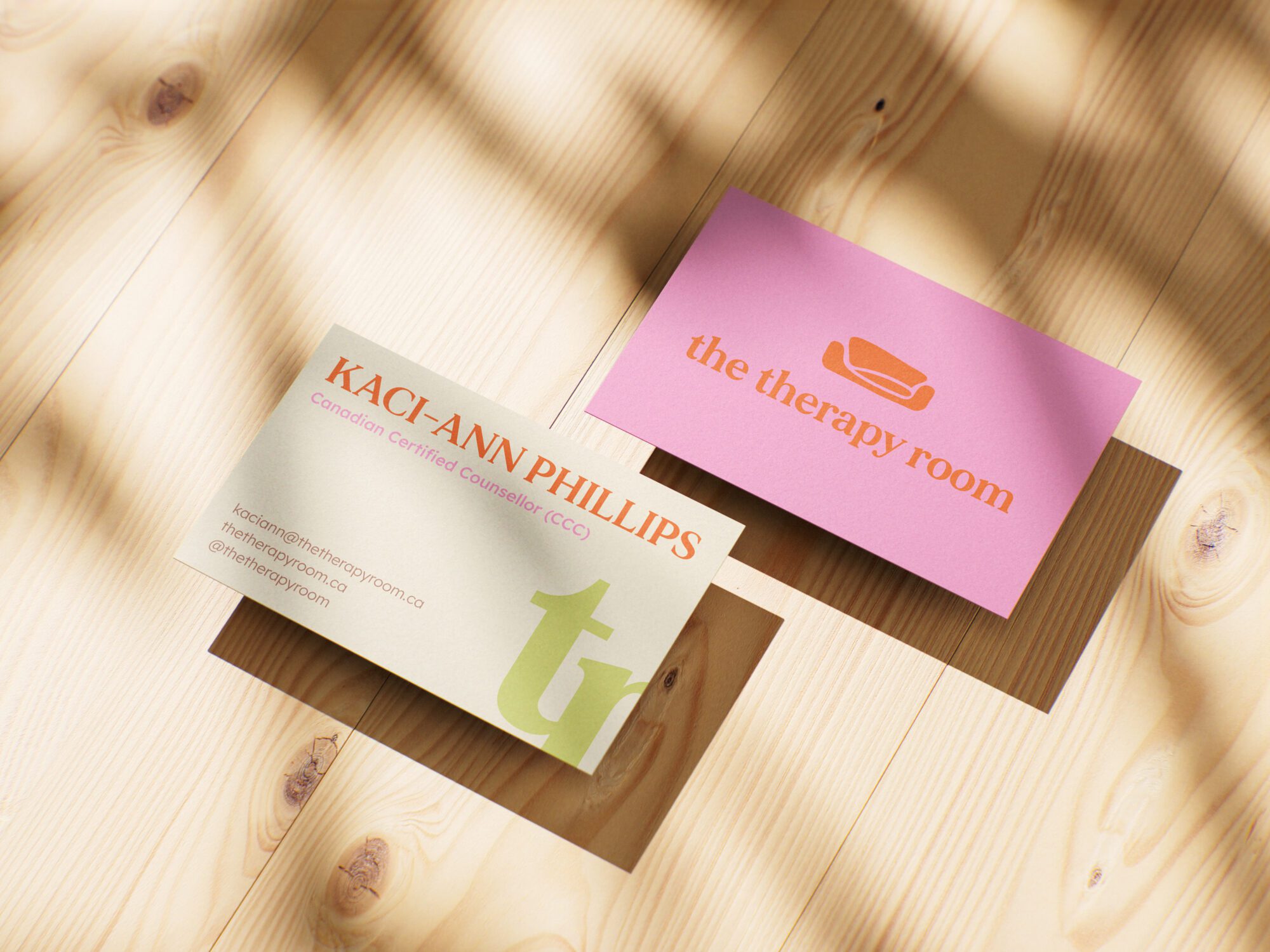
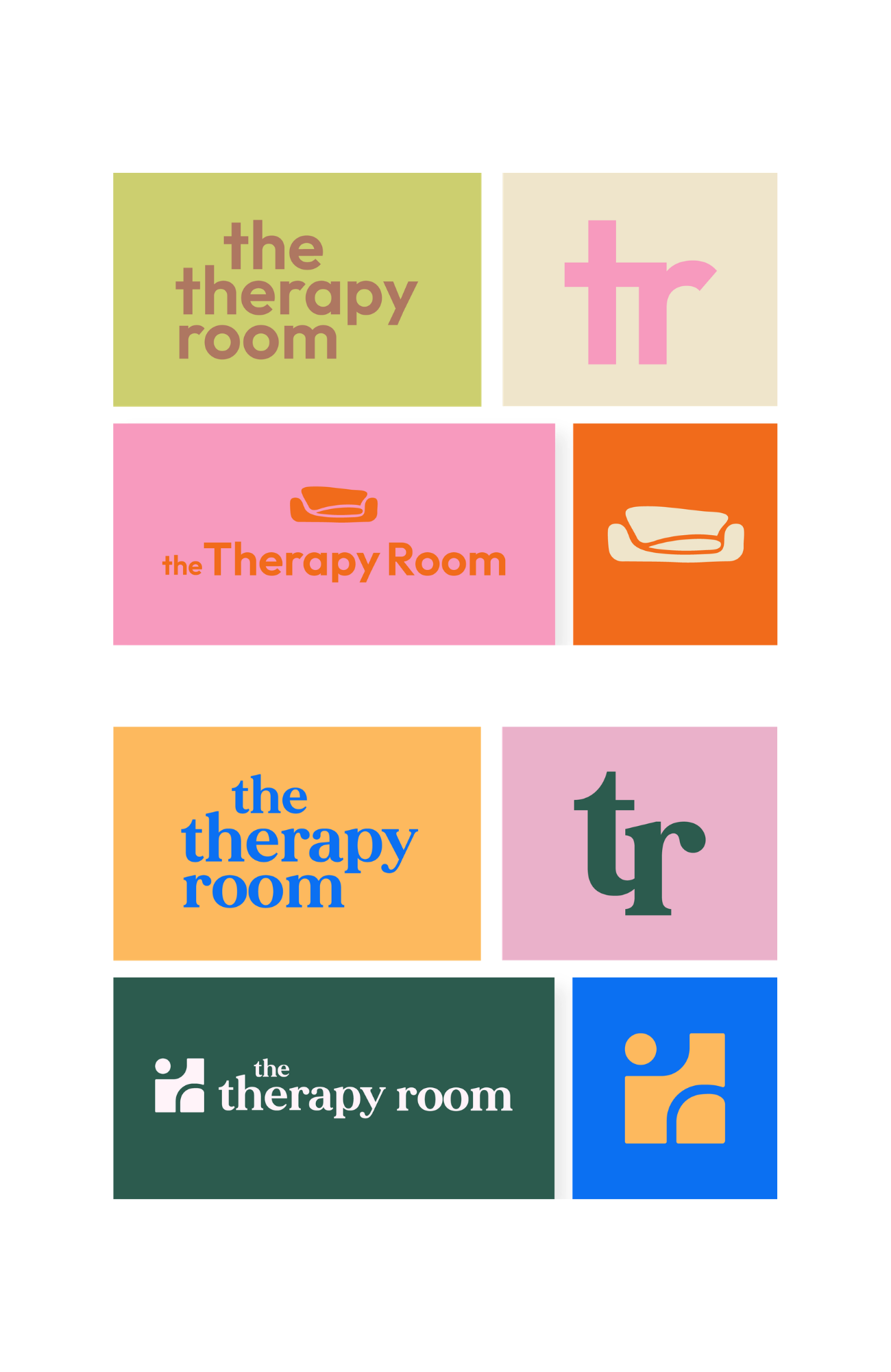
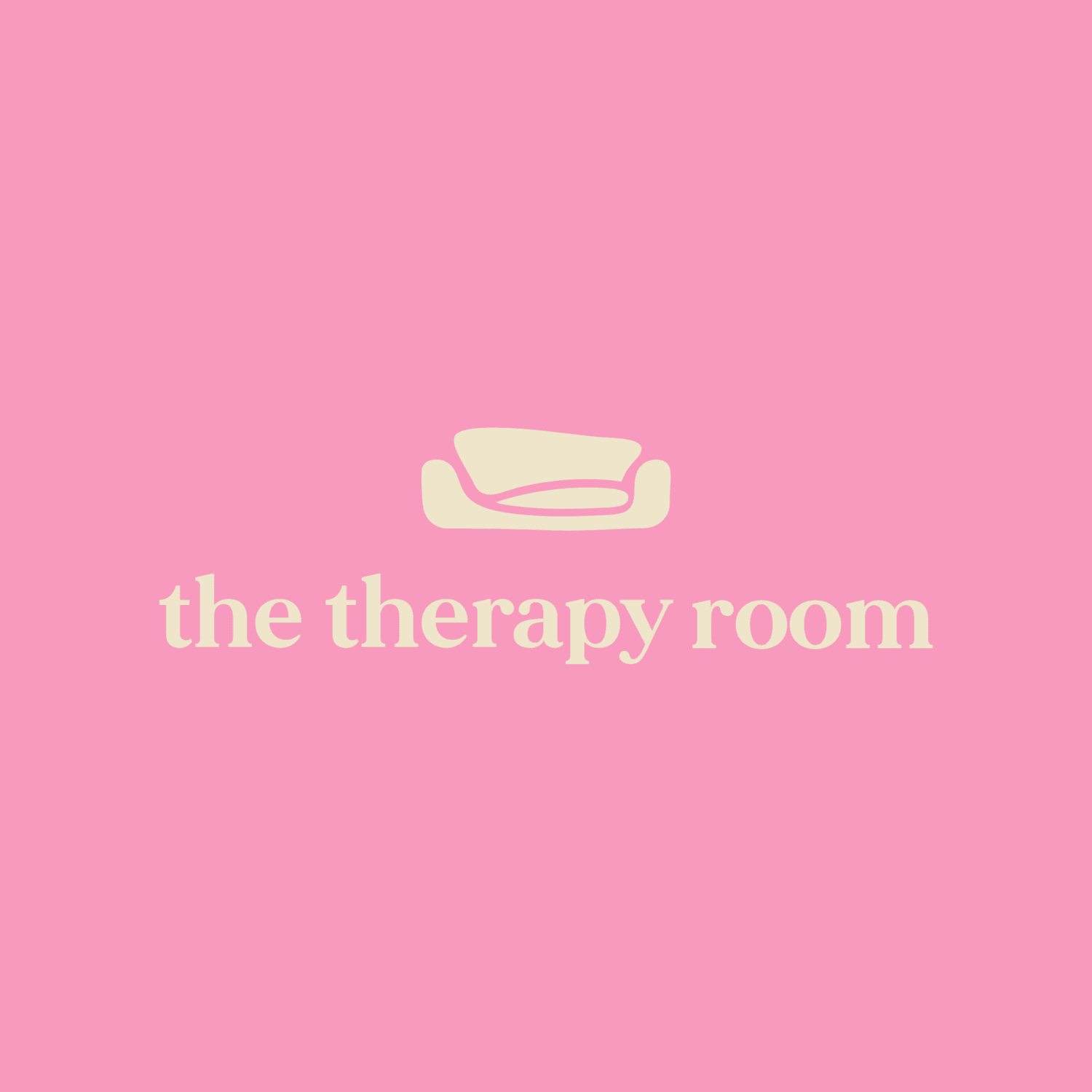
The core idea behind the logo was pairing a soft, bold serif wordmark with an abstract, rounded couch icon. The couch is the most literal symbol of the work itself: a safe, grounded space to sit down and be fully present. Keeping the shape abstract rather than illustrating an actual couch was a deliberate call. An icon that’s too obvious can make a brand feel dated. An abstract, rounded form stays modern and can scale down to a small social icon without losing its meaning.
The main design challenge was building a system flexible enough for every real-world use: a large website header, a small Instagram avatar, and a favicon, without asking any single mark to do all of that work. That’s why the identity includes several coordinated variations rather than one logo stretched to fit every space.
The Results
The finished identity gave The Therapy Room a full logo suite built to work everywhere the business shows up, from a website header down to a small social icon, along with a warm, retro-inspired colour palette and a typeface pairing that balances a soft serif with a clean, easy-to-read sans serif.
The colour palette and the logo concept carry the most strategic weight in this system. Every colour maps to a specific therapeutic idea rather than sitting in the palette for decoration, and the couch icon translates an abstract feeling–safety and groundedness–into something a client can recognize at a glance. That’s the whole brief, made visible.


The Outcome
The Therapy Room now has a complete visual identity that looks nothing like the clinical, interchangeable branding common across the industry, and everything is like the warm, grounded practice Kaci-Ann built it to be.
Kaci-Ann summed it up herself: “Everything felt aligned, intentional, and so reflective of the vision I had in my head, but elevated in ways I couldn’t have done on my own.” After seeing the finished content from the accompanying brand shoot, her reaction was just as direct: “I am completely obsessed with all of these, you both made my vision come to life.”
That’s the measure of a good visual identity project. Not just a logo that looks nice on a screen, but a brand that finally matches the care already happening inside the business. The Therapy Room launched with a look and feel that tells clients exactly what Kaci-Ann wanted them to know before they ever booked a session: this is a space where you get to be honest, and you get to be seen.